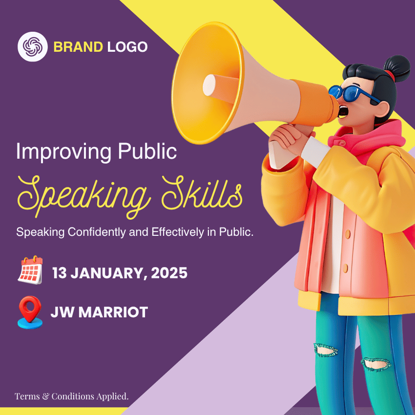
9 Easy Design Aesthetic Rules
Every Beginner Should Know
Whether you’re designing social media posts, presentations, websites, or ads, good design is not just about looking pretty—it’s about clarity, balance, and intent. As a beginner, you might feel overwhelmed, but following a few simple aesthetic principles can drastically improve your design game.
Below are 9 easy-to-follow design rules that can instantly make your work look professional and clean—even if you’re just starting out.
1. Stick to 2–3 Fonts Max
Using too many fonts makes your design confusing.
✅ Choose 1 for headings, 1 for body text, and maybe 1 for accents like quotes or highlights.
❌ Avoid mixing 5 different font styles in one design.
Tip: Pair a bold font with a clean sans-serif for contrast.

❌ Bad: Confusing visual hierarchy due to five clashing fonts.

✅ Good: Clean and professional look using two well-paired fonts.
2. Follow a Colour Palette (3–5 Colours)

❌ Bad: Overwhelming and inconsistent color usage hurting readability.

✅ Good: Balanced design using a harmonious color scheme.
3. Use Whitespace Generously
Whitespace (empty space) isn’t wasted space. It helps the design breathe.
✅ Let your elements have room to stand out.
❌ Don’t cram everything into one tight layout.
Whitespace gives your design a clean, minimal feel.

❌ Bad: Cluttered layout makes the message hard to absorb.

✅ Good: Ample whitespace creates clarity and focus.
4. Align Everything
Alignment builds structure and visual harmony.
✅ Align your text, buttons, and images with each other.
❌ Avoid randomly placing elements without a grid or alignment guide.
Stick to left, center, or right—don’t mix all three.

❌ Bad: Misaligned text and visuals make the layout look amateur.

✅ Good: Aligned elements create a structured, neat appearance.
5. Maintain a Visual Hierarchy
Guide your viewer’s attention with size and boldness.
✅ Make headlines big, subtext medium, and small text light.
❌ Don’t make everything the same size or weight.
Think of it like a newspaper layout—important stuff stands out first.

❌ Bad: No clear focal point; everything looks equally loud.

✅ Good: Headline stands out clearly, guiding the eye.
6. Be Consistent with Icon & Image Styles
Consistency creates trust.
✅ Use all flat icons, all outlined, or all filled—just pick one style.
❌ Don’t mix 3D icons with flat illustrations and stock photos.
Matching styles make the design feel intentional.

❌ Bad: Mixed illustration styles break the design’s flow.

✅ Good: Uniform icon or element style adds polish to the design.
7. Avoid Too Much Text
Less is more when it comes to visuals.
✅ Break long text into bullet points or visuals.
❌ Avoid paragraphs in your posters or social media posts.
Keep your message short, punchy, and clear.

❌ Bad: Excessive text overwhelms the viewer instantly.

✅ Good: Concise copy with strong visual appeal.
8. Use Contrast for Readability
Your text must pop off the background.
✅ Use dark text on light backgrounds (or vice versa).
❌ Avoid light grey text on white or yellow on light backgrounds.
Contrast improves readability and visual impact.

❌ Bad: Low contrast blends text into background, hurting legibility.

✅ Good: Strong contrast ensures text is easily readable.
9. Keep It Simple
Complex design = confused viewer.
✅ Focus on one key message.
❌ Don’t throw every idea, service, or offer into one visual.
Simplicity wins attention.

❌ Bad: Too many competing elements dilute the core idea.

✅ Good: Minimal elements keep the focus on the message.
Final Thoughts
You don’t need a design degree to create beautiful, effective visuals.
Just stick to these rules, stay intentional, and keep practicing.
And remember — design is more about communication than decoration.


